Websites
Why One Call to Action Beats Five Every Time
Author: Trevor Hunter
Published: October 4, 2025
Most business websites try to be accommodating. They want to give visitors options. Phone numbers, contact forms, chat widgets, email links, social messages, booking tools—all visible at once. On paper, that sounds customer-friendly. In reality, it's a conversion killer.
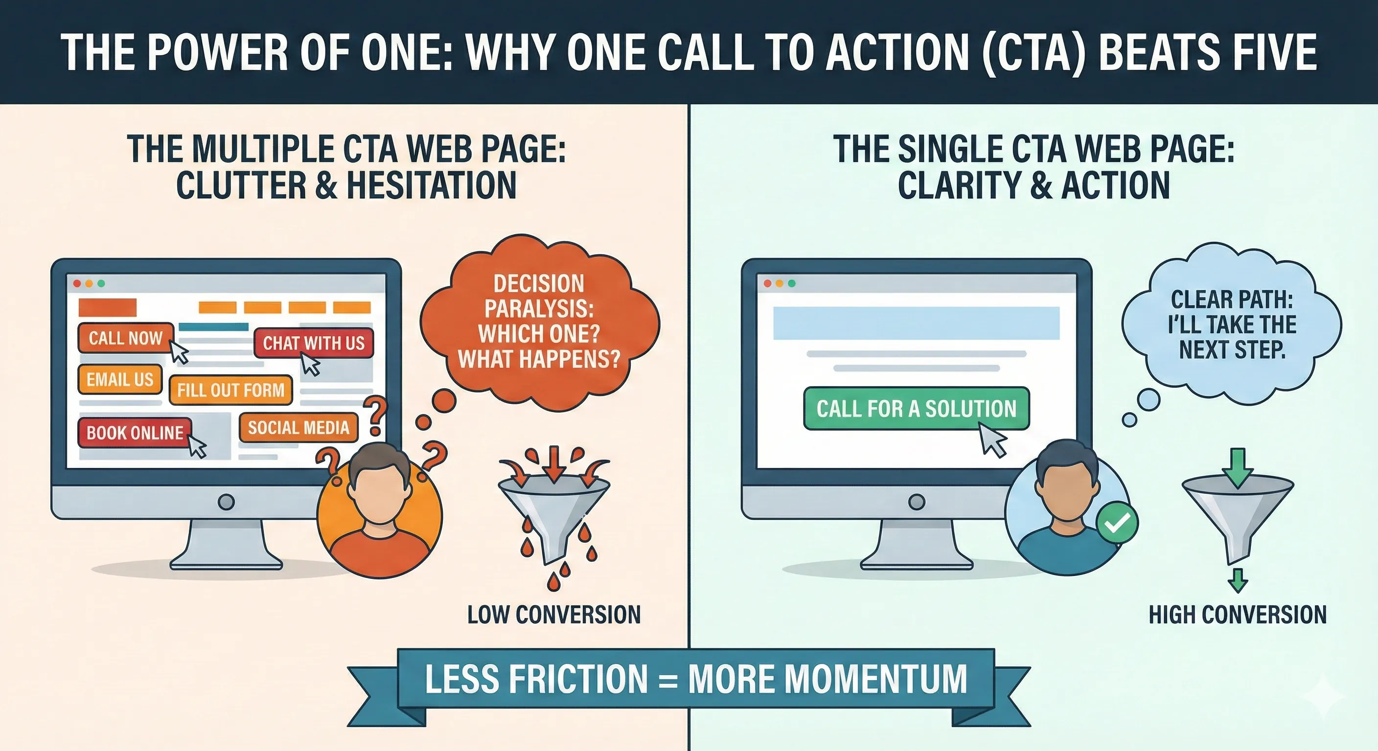
People don't visit service business websites to explore communication preferences. They visit because they want a solution and they want it now. When a site presents multiple calls to action, it forces a decision before the visitor is ready to make one. That hesitation is usually enough for them to leave.
Every additional call to action adds friction. Instead of thinking about the service, the visitor starts thinking about process. Should I call? Should I fill out a form? Should I chat? What happens if I pick the wrong one?
That moment of uncertainty is where conversions die.
High-performing websites remove that burden. They decide for the visitor. One primary call to action, clearly presented, supported everywhere else on the page. The user doesn't have to think. They just act.
For most service-based businesses, that action is a phone call. People searching for a service are often in problem-solving mode. They want reassurance, pricing context, and scheduling clarity. A conversation does that faster than any form.
Forms also create delay. They introduce waiting. Waiting gives people time to second-guess, keep browsing, or forget they reached out at all. Phone calls convert better because they collapse time.
Multiple calls to action also create operational problems. Messages come in from different channels at different times. Responses are inconsistent. Some get missed entirely. That inconsistency damages trust more than not offering the option in the first place.
Businesses assume more options equals better service. Customers experience it as disorganization.
One call to action doesn't mean one communication method forever. It means one primary path for the website. Secondary options can exist deeper in the site for people who need them. They just don't compete for attention at the decision point.
Clarity converts because it reduces risk. When the next step is obvious, people feel safer taking it. When they have to choose how to engage, they hesitate.