Websites
Why More Website Features Usually Mean Fewer Customers
Author: Trevor Hunter
Published: September 30, 2025
Business owners love features. They feel like value. More options, more tools, more sections, more integrations—it all sounds like progress. In practice, it usually does the opposite.
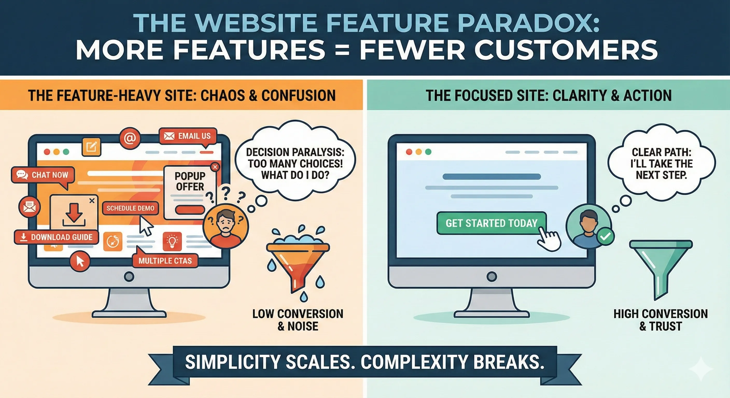
Every feature added to a website increases cognitive load. That matters because visitors are not evaluating websites in a calm, focused state. They're comparing options, multitasking, and trying to make a decision quickly.
When a website presents too many choices, the brain doesn't feel empowered. It feels unsure.
This is where most websites quietly fail. They try to be helpful by offering every possible path forward. Chat, email, phone, contact forms, scheduling tools, downloads, popups, and multiple calls to action all compete for attention. Instead of clarity, the visitor experiences friction.
Decision paralysis sets in.
The result isn't that visitors choose a different option on the site. The result is that they choose nothing and leave.
Features also slow websites down—both literally and figuratively. More scripts, more integrations, and more third-party tools increase load times and points of failure. Even small performance hits compound when a site is already competing for attention.
Beyond performance, features dilute intent. A website should guide someone toward a specific action. When multiple actions are presented as equally important, none of them feel urgent.
High-performing websites are opinionated. They don't ask visitors what they want to do. They decide what the website is for and build everything around that.
Another issue is operational reality. Every feature that allows customer contact creates another channel that has to be monitored, responded to, and managed. Businesses underestimate how much chaos that introduces. Missed messages, slow replies, and inconsistent follow-ups hurt trust more than not offering the feature at all.
Simplicity scales. Complexity breaks.