Websites
What Makes a Website Convert (That Most Designers Ignore)
Author: Trevor Hunter
Published: July 3, 2025
Most conversations about website conversion start in the wrong place.
Designers talk about color palettes, animations, typography, and layout trends. Marketing people talk about funnels, heatmaps, and A/B testing. Business owners usually assume conversion is some kind of optimization trick layered on after the site is built.
None of that is where conversion actually starts.
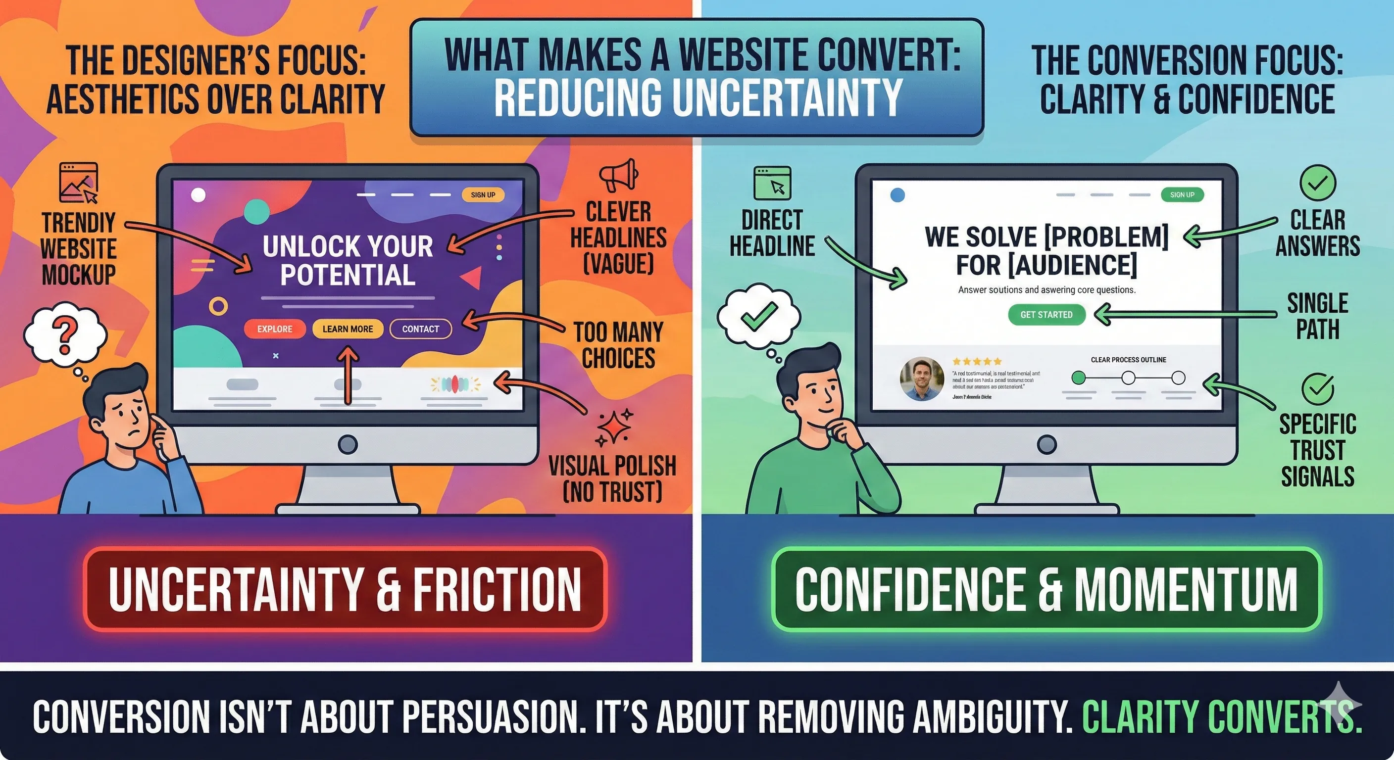
Websites convert when they reduce uncertainty. That’s the job. Everything else is secondary.
When someone lands on a website, they’re not there to be impressed. They’re there to decide. The decision window is short, and the questions are predictable.
What do you do?
Is this for me?
Can I trust you?
What happens if I take the next step?
If a website doesn’t answer those questions quickly and clearly, no amount of visual polish will save it.
One of the most common mistakes designers make is prioritizing aesthetics over clarity. They assume that if something looks modern or premium, people will trust it. In reality, trust comes from understanding. People trust what they can quickly make sense of.
That’s why clever headlines often fail. They sound good but say nothing. Visitors shouldn’t have to decode your message. If someone can’t immediately explain what you do after a quick glance, the site has already lost.
Another overlooked factor is decision friction. Many websites give visitors too many choices too early. Multiple calls to action, competing buttons, chat widgets, popups, forms, and links all fight for attention.
This doesn’t make the site more helpful. It makes it harder to decide.
High-converting websites are opinionated. They guide visitors down a single primary path. They don’t ask people what they want to do. They tell them what to do next.
Messaging hierarchy matters more than most people realize. The order in which information is presented determines whether someone stays engaged. Leading with background information, company history, or abstract value statements wastes time. The visitor hasn’t earned that depth yet.
Conversion-focused websites lead with relevance. They show the visitor they’re in the right place before asking for anything.
Trust signals are another area where designers often miss the mark. Logos, stock photos, and generic testimonials don’t build confidence. Clear language does. Specifics do. Showing that you understand the customer’s problem does.
People are skeptical by default. They’ve been burned before. A website that acknowledges that reality performs better than one that assumes goodwill.
Speed and performance are also conversion factors, not just technical concerns. A slow site feels unreliable. A laggy interaction creates doubt. Even small delays subconsciously signal friction.
Most users won’t articulate why they left. They’ll just leave.
Another thing most designers ignore is intent alignment. A website should match why someone searched in the first place. If a visitor arrives looking for a solution and is greeted with branding language instead, there’s a disconnect. That disconnect kills momentum.
High-converting sites feel like a continuation of the search, not a detour.
Finally, conversion is about confidence, not persuasion. The goal isn’t to convince someone to do something they don’t want to do. It’s to make it easy for the right person to move forward.
That means removing ambiguity, not adding pressure.
Most designers focus on what looks good in a portfolio. Businesses need sites that work under real-world conditions, with distracted users, limited time, and competing options.
A website that converts isn’t loud.
It’s clear.
And clarity is something most designers spend surprisingly little time on.