Website developers who build absolute garbage really should not be talking shit in other website developers' comments.
Because sometimes that ends with somebody taking a look at the websites you build. And when the websites you build are this bad, that is not a conversation you're going to enjoy.
A couple days ago I had a slide ad running for Foundation. Pretty simple. Pretty clear. It said what the offer is, what it costs, and exactly what the monthly fee includes. Not vaguely. Not hidden in fine print. Not buried behind some form. It was right there on the slide in plain English.
Then this guy jumped into the comments with "what's the $100 a month for, gatekeeping is bad," as if the answer was not already sitting directly under the price. So I replied, explained it, and pointed at the thing he somehow missed even though it was already in the image. He still kept pushing like the answer was not there.

The slide said $1,000 to build, $100 a month, and that the monthly fee includes hosting, SSL, backups, monitoring, and maintenance. The answer was literally on the slide.
So while I was wrapping up for the night, I got curious. If this guy felt that confident talking shit in another developer's comments while struggling to read a pricing slide, what kind of amazing websites was he building?
So I grabbed a couple URLs off his portfolio page. Which, in theory, should be the work he is most proud of. That is the whole point of a portfolio. It is supposed to be proof. It is supposed to show your standard. It is supposed to make the case that you know what the hell you are doing.
Although, to be fair, in this particular guy's case, this might actually be most of the work he has, because a number of the portfolio sites were already dead. Just gone. Websites for businesses that do not even exist anymore. So I guess they worked incredibly well. Worked so well the businesses disappeared.
And the ones that were still online were bad. Embarrassingly bad. Slow. Sloppy. Missing fundamentals. Builder-heavy. Template-stacked. Technically weak. The kind of websites that look fine if all you know how to judge is whether there is a logo and a hero section, then fall apart the second you look under the hood.
So let's go through them.
Developer in question
Neil Patterson-Azzopardi, founder of QED Web Design (weareqed.com), founded in 2022. His site claims over 15 years of WordPress experience.
Neil also mentioned in the comments that he wins awards every year. That is technically true. He buys awards every year. The one award he was involved in that was not pay-to-play was a local award in a niche category, and he did not even win it. So yes, Neil, you can say "award-winning developer" and not technically be lying.
- Tech South West Awards 2025, Sustainability Finalist — Legitimate
- Corporate LiveWire 2024, Web Design Studio of the Year — Pay-to-play
- Innovation in Business MarTech 2024, Best Web Design Studio - Devon — Pay-to-play
- Corporate LiveWire 2023, Web Design Studio of the Year — Pay-to-play
- Innovation in Business MarTech 2023, Best Web Design Studio - Devon — Pay-to-play
The best of the bunch, which is not saying much, was The SV Group. It was the best of the bad, and even then it was massively flawed.
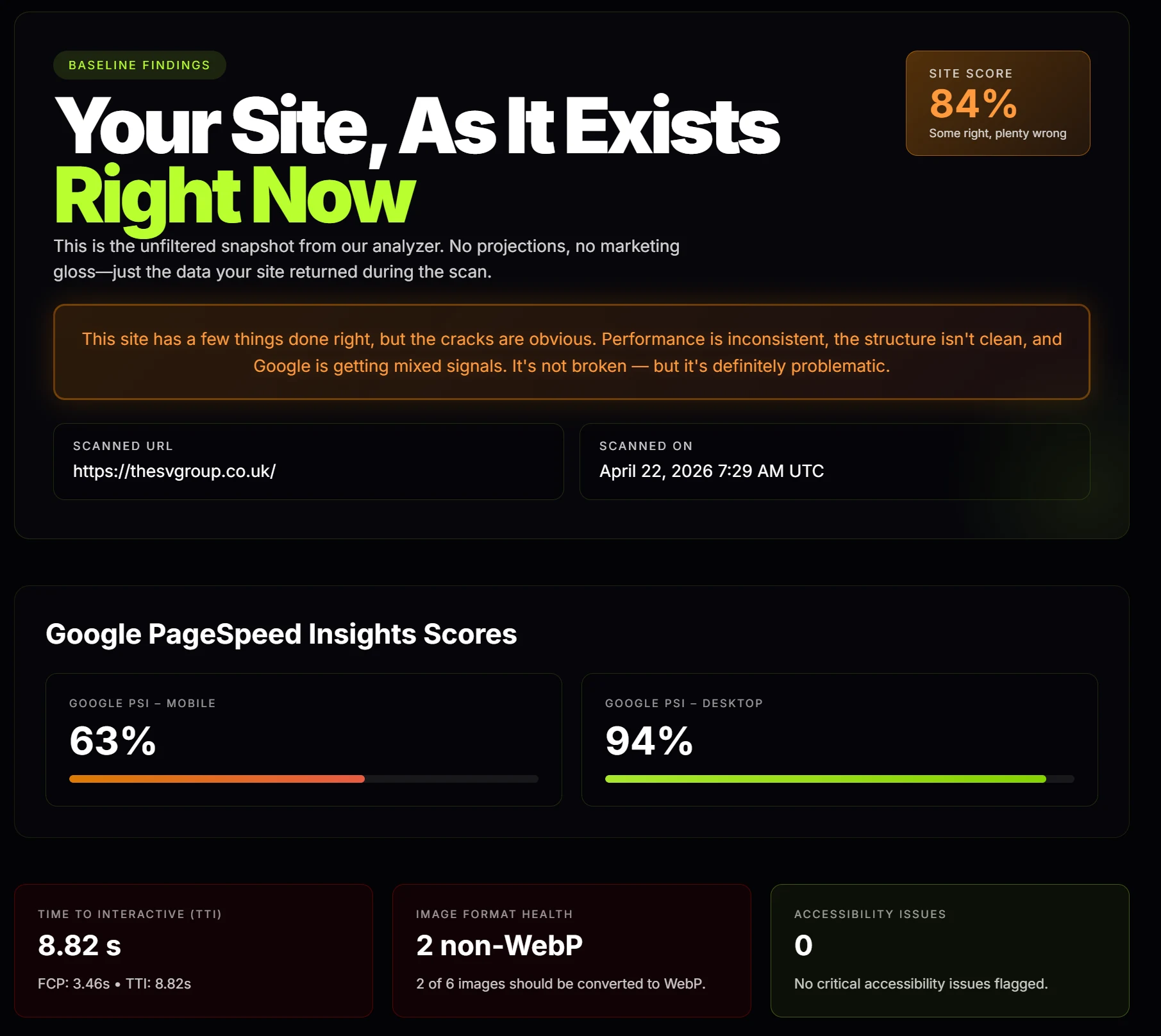
thesvgroup.co.uk, the "best" of the portfolio. Mobile PSI: 63%. TTI: 8.82 seconds.
Here's what was wrong with it:
- Mobile PSI score: 63
- Time to Interactive: 8.82 seconds
- Largest Contentful Paint: 5.71 seconds
- Title tag was too long
- Heading hierarchy was broken
- Twitter card metadata was missing
- Still had 2 non-WebP images
Then when you look at what it is actually built on, it gets even funnier. It is a WordPress, Impreza, WPBakery combination. So no, this is not some custom-coded attempt at a website. It is literally an off-the-shelf theme with a drag-and-drop builder. That is fine if you paid somebody $50 on Fiverr. It is not fine when a so-called professional developer is charging businesses real money. So he takes something somebody else built, slaps a new logo on it, changes the colors, swaps a few images and some text, and calls it custom.
But there is nothing custom about that. It is lazy amateur work. And what makes it worse is that he did not even do everything the system already allows you to do. Alt tags. Meta descriptions. The basic stuff. If you put a title tag in that is too long, it literally warns you. He had to type it in and then ignore the warning. It is idiot-proof, but apparently not for this guy.
Prep Recruitment was next, and it was bad before you even scan it. It literally has a blank hero section. The most valuable real estate on the page, the first thing users see when they land, is empty. That is a wild decision. The whole thing has that same cheap builder-made feel where somebody stacked blocks on a page and called it a website.
Then you scan it and it gets worse.
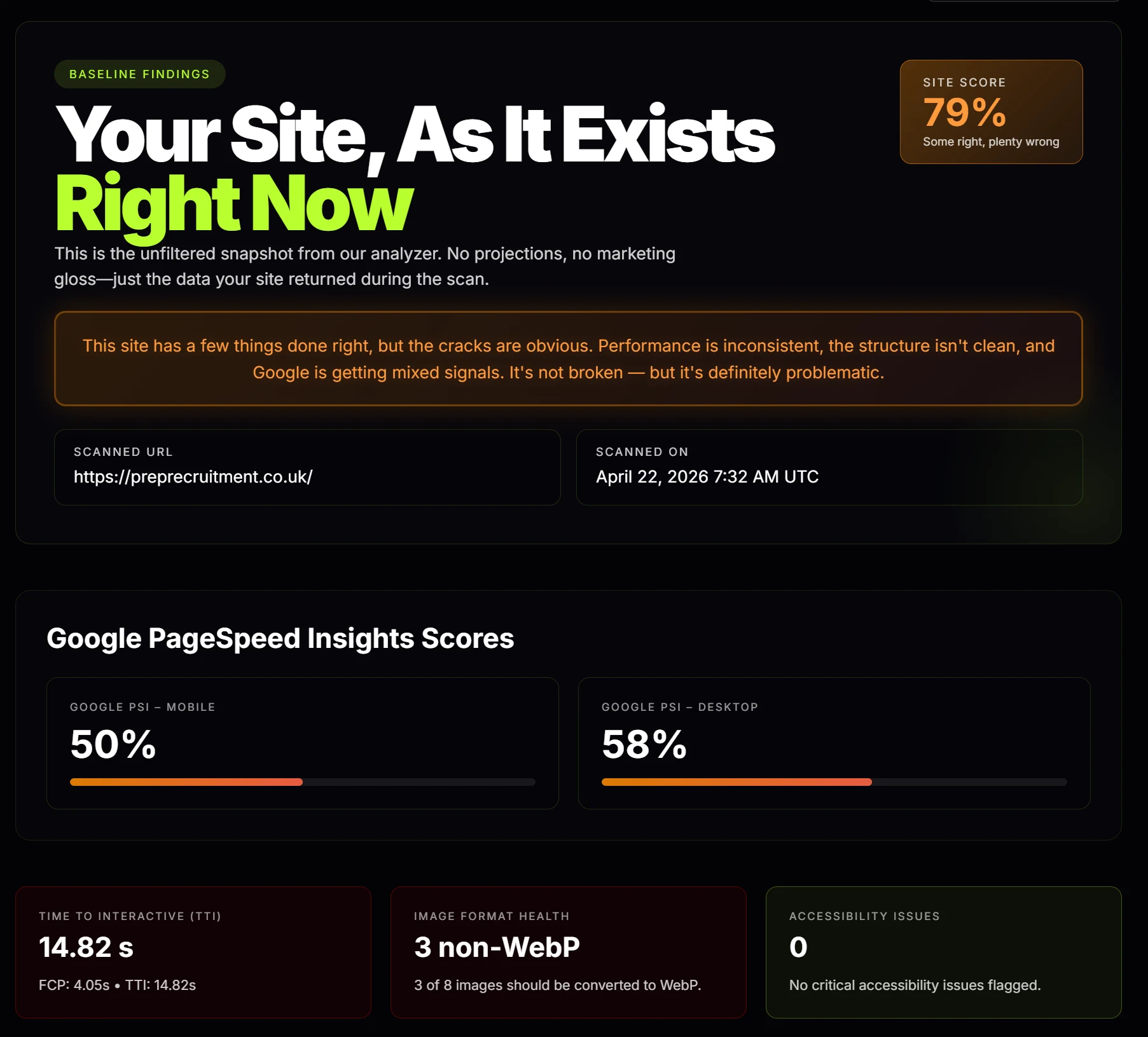
preprecruitment.co.uk, Mobile PSI: 50%. TTI: 14.82 seconds. Mixed content on HTTPS.
Here's what was wrong with it:
- Mobile PSI score: 50
- Desktop PSI score: 58
- Time to Interactive: 14.82 seconds
- Largest Contentful Paint: 9.68 seconds
- Mixed content on HTTPS
- Sitemap sample returned an error
Same story underneath. WordPress with Elementor. Not a custom build. Just more off-the-shelf infrastructure with a drag-and-drop builder, rearranged branding, and a bill for the privilege.
Moxley McDonald was next, and this one is useful for a different reason. It proves a site can have decent speed numbers and still be incomplete garbage.
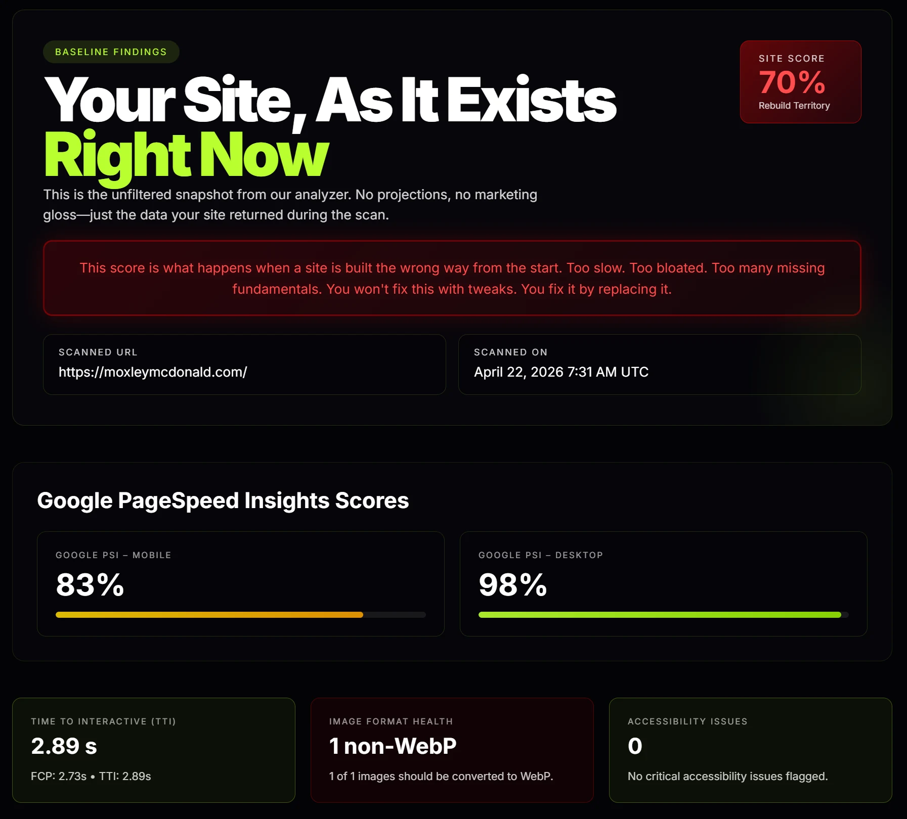
moxleymcdonald.com, PSI looks fine. Meta description, Open Graph, and structured data were all missing.
Here's what was wrong with it:
- Meta description was missing
- Open Graph title was missing
- Open Graph description was missing
- Open Graph image was missing
- Twitter card metadata was missing
- Structured data was completely missing
- No WebP images
- No srcset
- CLS was 0.167
Speed is one number. The list above is why one number does not prove quality. If the fundamentals are missing, they are missing. That does not magically become okay because it loaded a little faster.
Ancient Shepherds was next, and this is another one that proves a site can look more polished than the others and still be weak where it counts. This one is cleaner than some of the other messes in the portfolio. That does not mean it is good.
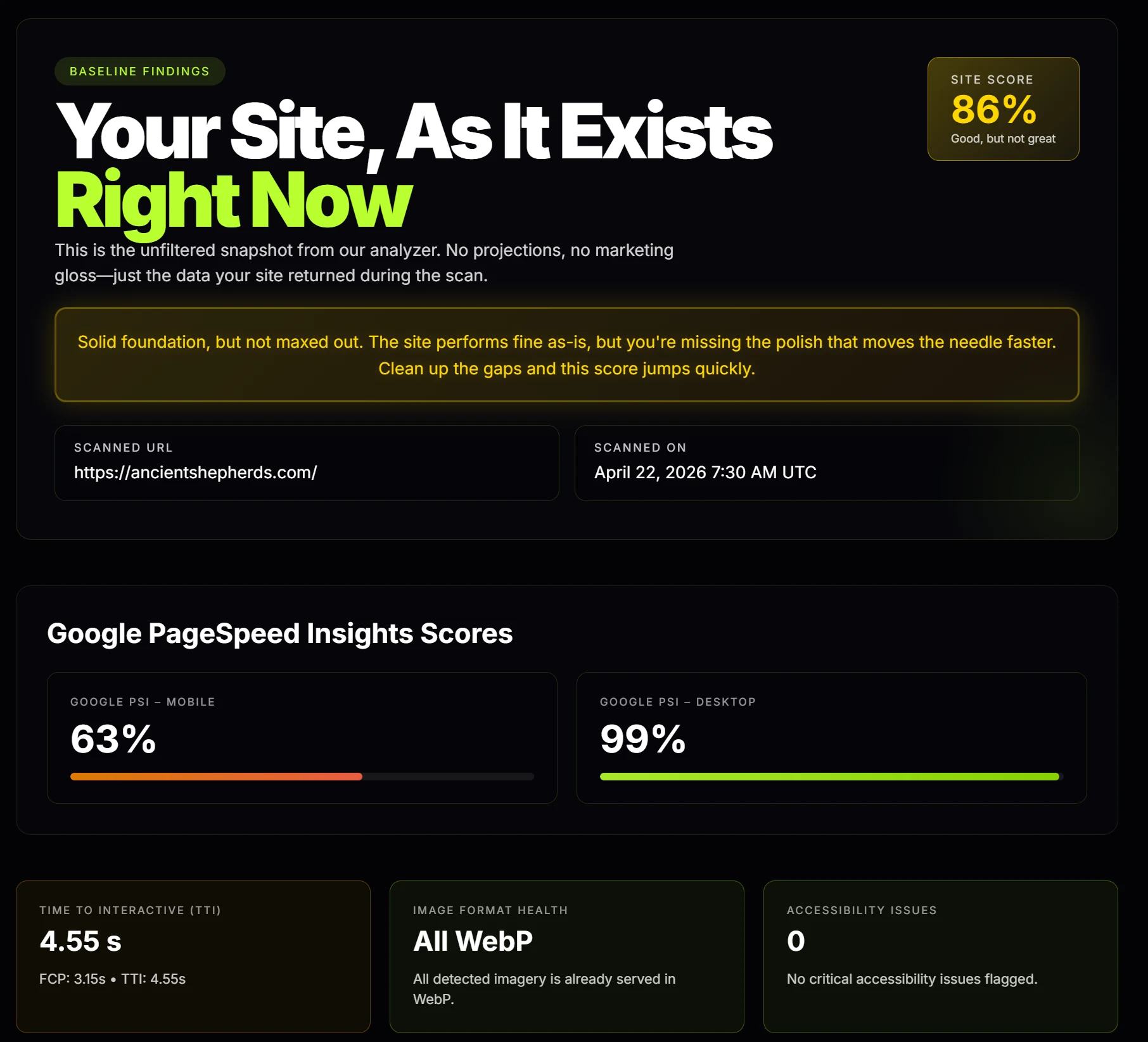
ancientshepherds.com, Site score 86%, but TTI 4.55 seconds, mixed content, and no responsive image setup.
Here's what was wrong with it:
- Time to Interactive: 4.55 seconds
- Largest Contentful Paint: 4.5 seconds
- Mixed content on HTTPS
- No srcset
- No lazy loading
Not a disaster, just still not good. Polished enough to fool somebody who does not know what to check. That is the pattern with this guy's work. Even the cleaner-looking ones come back with basic misses that should not be there.
The Pickled Crab Deli was next, and this one is a shit show before you even run a scan. It is a giant moody hero image with a neon sign, a centered headline, a bunch of dead space, then a basic brochure layout dumped underneath with two buttons, three fish photos, social icons, and a footer that looks like an afterthought. It does not look sharp. It does not look premium. It does not look especially functional. It looks like somebody tried to make it feel atmospheric and forgot the part where it still has to be a good website.
Then you scan it and it gets worse.
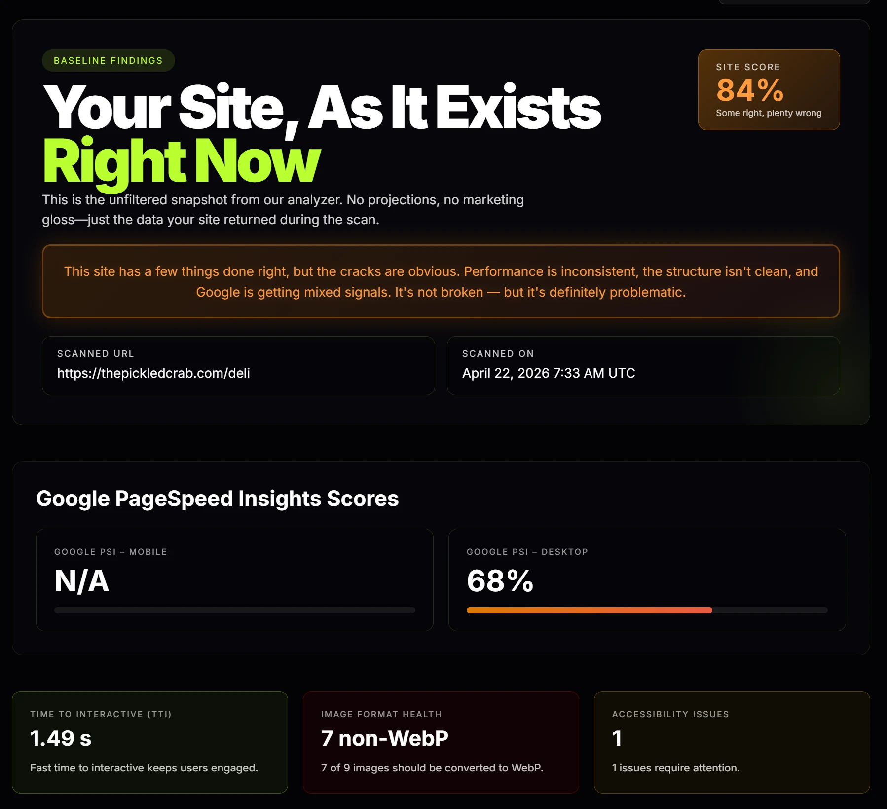
thepickledcrab.com/deli, Mobile PSI: 53%. TTI: 15.19 seconds. Missing metadata, broken headings, alt text absent.
Here's what was wrong with it:
- Mobile PSI score: 53
- Time to Interactive: 15.19 seconds
- Largest Contentful Paint: 15.14 seconds
- Meta description was missing
- Heading hierarchy was broken
- Mixed content on HTTPS
- Alt text was missing
- No srcset
- No lazy loading
That is awful. And what makes it worse is how simple the page is. A brochure layout with one big image, a headline, a few sections, and some buttons. That should make it easier to get right. He still did not. That is not a complicated build gone wrong. That is basic work done badly.
Then we get to his own website, which should theoretically be the best of the bunch. It is not. Not even close.
From a stylistic perspective, I cannot even really speak to it because it looks stupid. It has this weird right-aligned text, which I noticed on a couple of the other sites too, so I am guessing he is repurposing the same template so he does not have to buy additional ones. And yes, templates cost money. Like $20. Maybe $19. Whatever. So I guess spending another $20 to make the next client project not look like the last one was just too reckless when you are charging businesses $1,000 or more for a website.
And even then, his own site still came back with problems.
Here's what was wrong with it:
- Mobile PSI score: 84
- Time to Interactive: 3.94 seconds
- Largest Contentful Paint: 3.92 seconds
- 10 out of 10 images flagged as non-WebP
- Mixed content on HTTPS
- No srcset
- No lazy loading
So this is one of the clearest examples of a so-called professional web developer taking people's money for work that just does not justify it. He has been around since 2022 and supposedly has over 15 years of experience. So no, this is not some unavoidable beginner gap. It is lazy. With four years in business and supposedly over 15 years of experience, the level of work in this portfolio is just not acceptable.
That is really what all of this is. A perfect example of overpriced garbage being sold by somebody who has not taken the time to learn the craft properly. And because I know these businesses are real, and because I know they spent good money on these websites and are probably paying him a monthly fee on top of that, I am going to leverage their misfortune into something useful. I am going to offer to rebuild their websites for absolutely free and give them one year free of service, hosting, and everything else. At least somebody benefits from this.
I will share those rebuild processes in the future.